


What Is Typography?
First thing to know is that Typography is an art (going way back to the 11th century in East Asia). Typography is the art and technique of organizing letters, numbers, symbols and text, styled in a way that is most visually appealing and clear to the reader or viewer.
Typography can bring text to life, and with the right font style and structure, can target or solicit certain emotions from it’s audience.
The very first example can be seen in the Gutenberg Bible, long before the digital age, where the typography was applied to books, magazines and the like.
It’s not just the choice of beautiful fonts, good typography creates a strong visual hierarchy and adds a graphical balance.
Typography is a great way to build brand recognition, as users will subliminally begin to associate the typeface featured to your brand. This can be the difference between someone feeling connected to your brand and its ability to stay memorable, or not..
You probably wonder what the actual difference is between “typeface” and “font.”
A typeface is a designed set of characters that make up a complete set of type, while a font is the digital file that allows users to type out or design alpha-numeric symbols on their computer.
So there are 3 kinds of typeface: Serif, Sans-Serif and decorative. (Secret: a good designer uses a maximum of 3 different fonts to keep a professional balanced look)
Typography can invoke a feeling, remind you of a certain brand, or create an atmosphere. It’s essence can reflect the personality of your brand or products in a native and intuitive way. Two things popular logos have in common are, simplicity and relevance.
Establishing a hierarchy is one of the most important principles of typography. What a typography hierarchy essentially is: a system used to organize type which creates an order of importance within the information presented, allowing viewers or readers, to quickly scan, find or navigate the content.
A very exciting element as well in typography is color. Here you can be really creative and elevate your creations and visions to a whole new level.
The five basic principles of typography design
- Balance presents a consistent structure
- Hierarchy defines organization and direction
- Contrast to accentuate highlights
- Repetition creates consistency and familiarity (memorability)
- Alignment shows a sharp and professionally structured image
Typography Terms
- Alignment: Is the setting of text flow or image placement relative to a page, column, table cell or tab.
- Aperture: The partially enclosed, somewhat rounded negative space in some characters.
- Apex: A point at the top of a character where two strokes meet.
- Arm: When a horizontal stroke is not attached to a stem on one end.
- Ascender: An upward vertical stroke found on the part of lowercase letters that extends above the typeface’s x-height.
- Backslant: Italics leaning backward.
- Ball Terminal: A circular form at the end of the arm in letters.
- Baseline: The invisible line where all characters sit.
- Bold: A heavy weight of any given typeface, often used for emphasis.
- Bowl: The fully closed, rounded part of a letter.
- Bracket: A curved or wedge-like connection between the stem and serif of some fonts. Not all serifs are bracketed serifs.
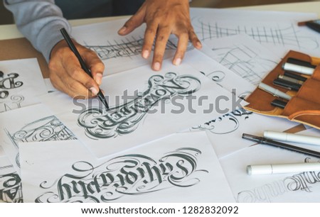
- Calligraphy: The art of writing letters with a very specific tool (e.g., brush pen, etc.)
- Cap Height: The height of a capital letter measured from the baseline.
- Center aligned: When text is aligned to the center of a text frame, with the rag on the left and right sides of the text frame instances where body copy is aligned within a text frame, creating a rag on both sides.
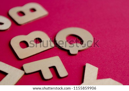
- Character: A letter, number, punctuation mark or symbol.
- Character Set: Entire collection of characters for any given typeface weight.
- Counter: The open space in a fully or partly closed area within a letter.
- Crossbar: The horizontal stroke in letters. Also known as a Bar.
- Descender: The part of the letters that extends below the baseline.
- Ear: A small stroke extending from the upper-right side of the bowl of lowercase.
- Ellipsis: Character composed of three dots.
- Extended: Character with an exaggerated width a character such as an accent mark.
- Grid: The invisible or actual layout of vertical and horizontal lines for alignment.
- Descender: The part of the letters that extends below the baseline.
- Display: A category of typefaces that is primarily used for headlines and subheads due to their heavy weight and/or detailed nature.
- Font Color: Used in web design to specify a color.
- Font Size: The height of a typeface. It is usually measured in points (8, 10, 12, etc.), from baseline to baseline.
- Font Weight: Font thickness (light, regular, medium, bold)
- Hook: A curved, protruding stroke in a terminal. Usually found on a lowercase f.
- Hand-lettering: Creating custom letters from scratch for a specific purpose/client.
- Italics: Forward-slanting characters.
- Joint: Stroke connects with a stem.
- Justified: Instances when text is aligned to the left and right margin within a text frame, with no rag on either side.
- Kerning: The space between individual pairs of characters.
- Leading: The horizontal space between two lines of text that is measured from baseline to baseline.
- Leg: Short, descending portion of a letter.
- Ligature: Two or more letters are joined together to form one glyph or character.
- Link: A stroke that connects the top and bottom bowls of lowercase double-story g’s.
- Lowercase: The smaller form of letters in a typeface.
- Monospaced: An example of a typeface where each character is the same width.
- Orphan: A single word that appears at the beginning of a page.
- Point size: The distance from the top of the highest ascender to the bottom of the lowest descender is the point size of any given typeface.
- Rag: The uneven vertical edge of a block of type. Could be on the left side, right side, or both.
- Readability: Degree to which text can easily be read.
- Right-aligned: When text is aligned to the right margin with the rag on the left side of the text frame.
- Sans Serif: No extension of strokes on characters.
- Serif: A stroke drawn at right angle or obliquely across the arm, stem, or tail of a letter. It is found on vertical and horizontal strokes of some characters. Serifs can also fall into different categories, such as slab or hairline, among others.
- Shoulder: The curved stroke aiming downward from a stem. The curve at the beginning of a leg of a character, such as in an “m.
- Stem: A vertical stroke in a letterform. Can be found in both lowercase and uppercase letters.
- Stress: Diagonal or vertical change in stroke width across a letter.
- Stroke: Any linear feature on a letter.
- Swash: Addition of a decorative stroke.
- System Font: Main font used by a computer operating system.
- Terminal: Any stroke which does not terminate in a serif is a terminal. It can be either straight or curved.
- Tracking: The amount of space between all letters across a line of text. It is also referred to as letter-spacing.
- Type Classification: Type of characters based on style.
- Type Properties: Qualities that allow characters to fit on a grid.
- Typeface design: The process of creating a complete set of characters in a specific style. This could include uppercase & lowercase characters, mathematical symbols, punctuation, numerals, etc.
- Type size: The distance from the top of the highest ascender to the bottom of the lowest descender. It is usually measured in points.
- Typesetting: The process of laying out large amounts of text (e.g., a book, a magazine, etc.) and making sure it’s legible and readable.
- Uppercase: Uppercase characters are the capital letters of the alphabet. Uppercase letters are normally used at the beginning of sentences and as the first letter of proper names.
- Vertex: The bottom point where two strokes are joined together.
- Widow: One word on its own line at the end of a paragraph or a column.
- X-Height: The height of lowercase letters in any given typeface. The measurement is based off the height of the letter ‘x’. Lowercase letters with curves (such as a, c, e, o, s, u, and others) usually extend slight below and above the x-height, to appear optically similar in size to other letters.
If you don’t know where to start, take a look at what other people are doing as a form of inspiration and reference. As they always say, practice makes perfect.
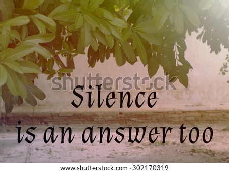
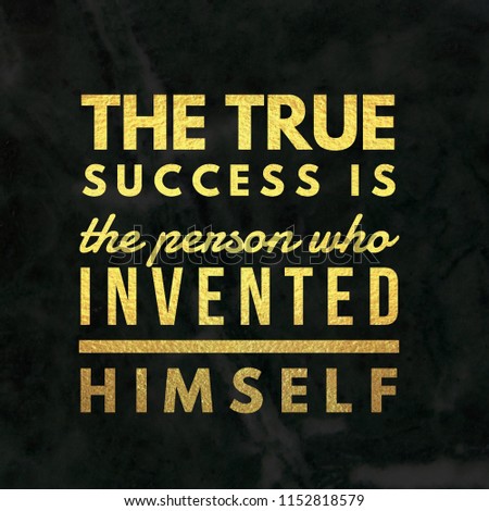
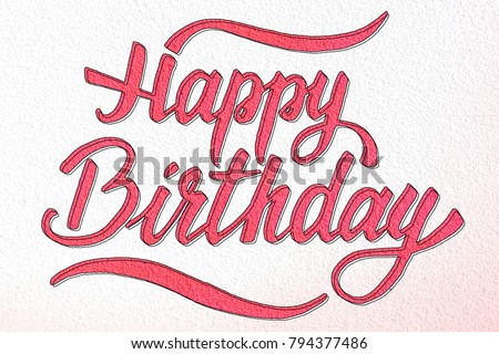
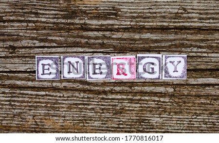
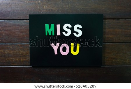
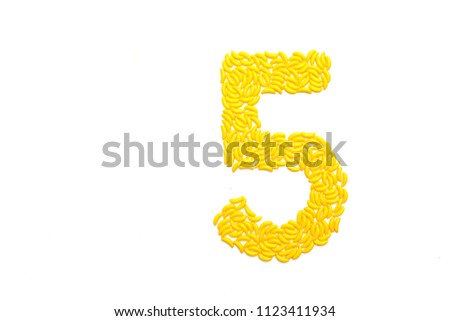
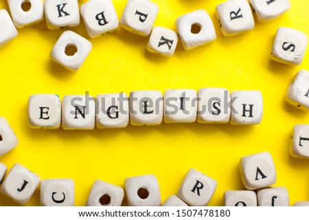
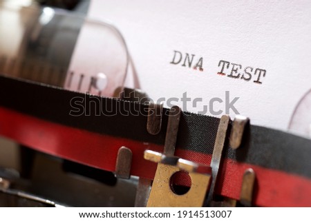
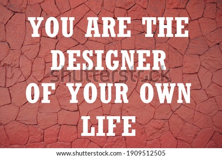
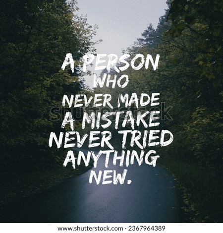
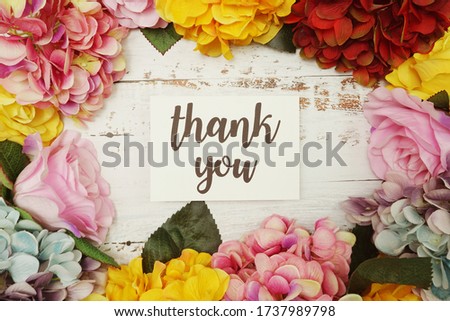
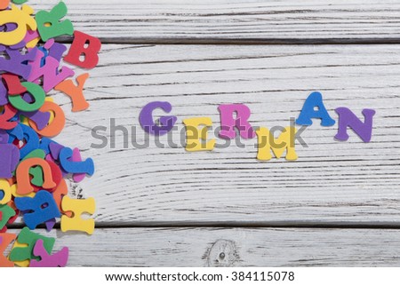
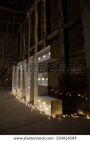
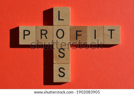
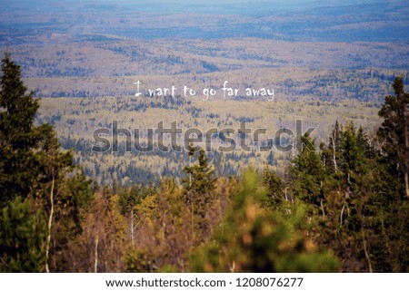
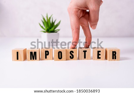
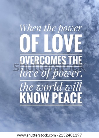
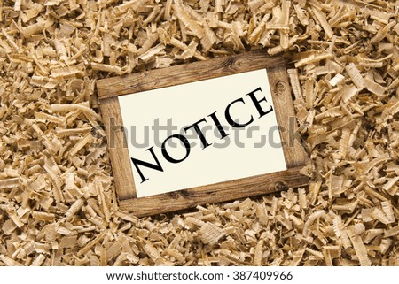
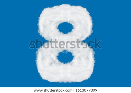
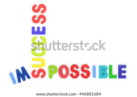
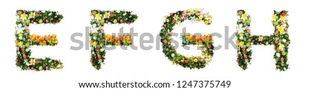
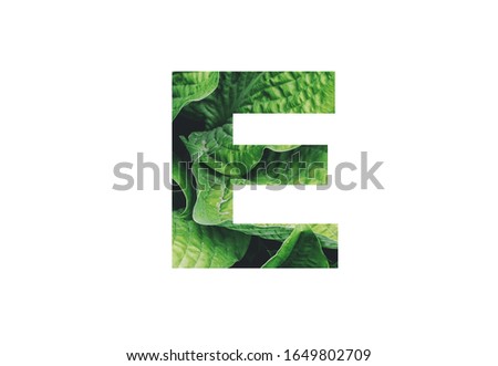
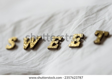
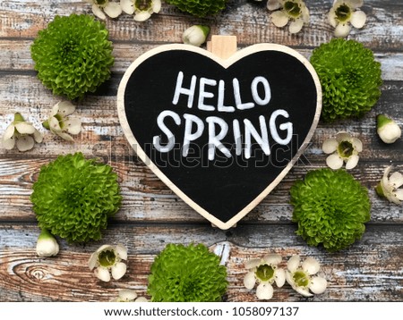
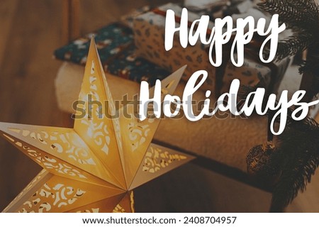
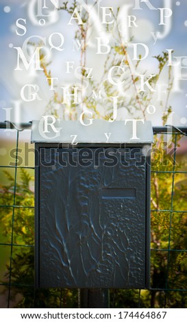
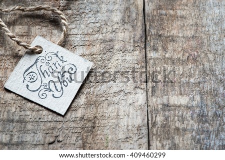
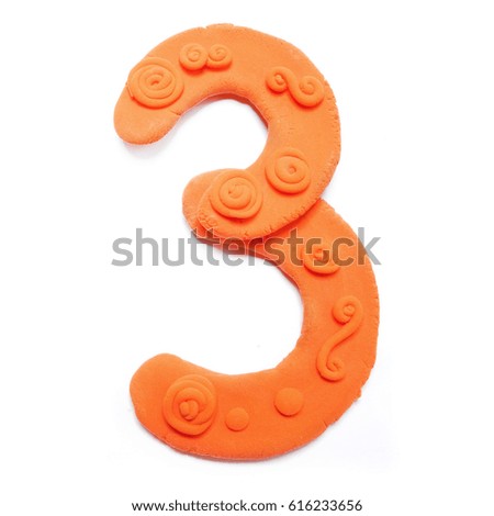
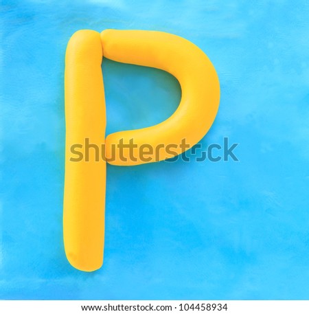
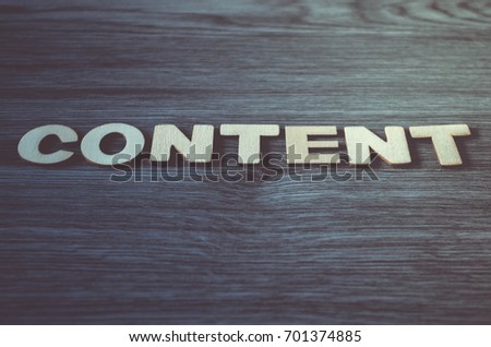
Types of imagery and stock photography, based on Typography, that you can find above:
- Stock Pictures / Pics
- Royalty-free Vectors
- Illustrations / Cartoons
- Wallpapers / Backgrounds
- Abstract Patterns
- Isolated / Green Screens


